![Designer Rian Hughes on Valiant’s New Graphic Identity [Interview]](http://townsquare.media/site/622/files/2012/05/logos-1335941528.jpg?w=980&q=75)
Designer Rian Hughes on Valiant’s New Graphic Identity [Interview]

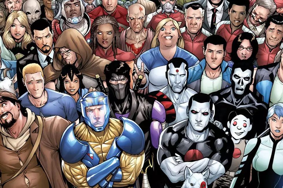
This week has seen the relaunch of the Valiant universe with the release of the first issue of X-O Manowar by writer Robert Venditti (The Surrogates) and artist Cary Nord (Conan the Barbarian). Coming in the months ahead are new incarnations of other Valiant properties Bloodshot, Harbinger and Archer & Armstrong from a roster of talent that includes writers Fred Van Lente, Joshua Dysart, Duane Swierczynski and artists Clayton Henry, Manuel Garcia and Khari Evans.
Naturally with a relaunched comic book universe comes a relaunched look, with new logos, mastheads and trade dresses courtesy of the legendary designer Rian Hughes of the London-based design firm Device. The visuals for the Valiant project draw on the 23-year history of the brand and franchises while refining some of them to better work in a 21st century marketplace. We recently had a chance to discuss the new Valiant look with Hughes, who discussed the challenges of rebranding a comics universe as well as his own philosophy on comic book design.Before we get to our interview with Hughes, it's helpful to take a look at Valiant's new company logo, which takes the implied "V"-shape of the compass from the previous logo by designer Henry Steiner, marries it with the compass shape from the original logo, and adds in a strong sans serif typeface that adds a subtle art deco feeling to the whole thing.

It's a solid, handsome logo, with a strong identity that is easily adaptable to a number of bold, fashionable colors. My only quibble would be the spacing between the "V" and "A", which seems to be set a little wider than the other letters in the logotype. Overall though, the logo is a strong spin on a classic foundation; the goal of any relaunch.
ComicsAlliance: Rian, you're no stranger to designing identities for comics companies, having designed the main logo for Archaia and having created numerous logos and mastheads for a number of publishers. What was it about reworking the Valiant logo that made you interested in the project?
Rian Hughes: Well, originally Valiant were going to run with the italicized version of the logo they had, but as we got deeper and deeper into plans for the line, redesigning it entirely to coincide with the relaunch seemed like a much better option. [Valiant Executive Editor] Warren [Simons] and [Chief Creative Officer] Dinesh [Shamdasani] agreed, and so began the process of working towards a new version. I think I'm probably just a nit-picking perfectionist (which some clients love and others get frustrated by!) and if I can take a project back to first principles and rethink the entire thing from the ground up, I will. It makes far more sense. You get a more cohesive and considered result instead of a disparate bunch of elements bolted together.
CA: Did you have an existing connection to the Valiant properties?
RH: No.

CA: What sort of objectives were you given at the beginning of the project?
RH: The brief was to update the existing logos and look, to not jettison entirely the heritage we had there. To build, freshen and modernize, but to still be Valiant. Some logos have moved on further from the originals than others, and that's probably due to how much we decided we wanted to reclaim from the original designs. The Archer and Armstrong logo bears little resemblance to the original, whereas the general layout of the X-0 Manowar logo is taken from the original. The Valiant logo itself takes the compass design and emphasizes the hidden "V" while enhancing it, ditching the fine serif type of the original, and locking it all together in a panel so the elements combine into a punchy cohesive whole. It's designed to be able to be used in different colors too, so it can be keyed to the colors in the art on the cover issue to issue.
CA: Let's talk process: how do you start a brand identity like this?
RH: I generally ask questions of the client: What do you want to say to your audience? How do you want to be perceived? What does the name mean to you? How can we express all this in an original, clean and fresh manner? Is the process for a brand identity different from, say, masthead design?
A masthead logo has to express the character of the star(s) of the book, so can be more quirky and idiosyncratic. A comic brand identity needs to be more of an umbrella design under which all these disparate characters can live, so is generally more universal and generic -- generic in a good way!

CA: What turned out to be the biggest hurdle with the Valiant identity?
RH: Redesigning a corporate logo can be a labor-intensive process. In fact, in the end, we came full circle to one of my earliest designs, but I think sometimes you need to see what doesn't work so you can be sure about what does work. I'm very happy with the result -- and the custom-drawn type has the right balance of characterful angularity (to match the compass' angularity) and readability.
CA: How much did the previous incarnations of these titles influence the mastheads of the current books?
RH: As I say, some more, some less. Some are very much of their time, but I do like to take something from the history and heritage of a character if I can, if there's a hidden gem of an idea there you can unearth and polish. Sometimes design is about knowing what you should keep, not just about knowing what to ditch.
CA: What was your favorite part of this assignment?
RH: My favorite part is seeing the books on the racks -- until they're actually printed, it doesn't seem finished. I'm one of those old-school designers who likes the smell of ink and the feel of paper.

CA: You do a lot of design outside of comics. Do you approach non-comics design differently than your comics work?
RH: Well, what I do try and do is inject a design sensibility taken from my broader experience of working in the music and publishing industries; to ask new questions and look at comic design in a different way. Looking in from outside comics, mainstream comic design can look samey and pretty clichéd for the most part -- there are many titles that don't stack up very well if you take them out of the comic shop and place them alongside the best work from other areas of graphic design. Overall, you'll see more innovative design in a music store or a bookshop than on the racks of a comic shop, which is strange as comics are essentially a visual medium sold to visually minded people. There are, of course, notable exceptions to this, and many comics publishers and designers are doing absolutely beautiful work, and generally the comics industry does look way better than it did when I started out designing comics. It's looking better all the time.
CA: What do you wish you saw more of in comics design?
RH: I'd like to see more design based on a strong underlying concept. Design that adheres to a solid grid. A more cohesive marrying of type and illustration into one piece.I'd like to see less use of fancy textures and shading to polish what is essentially a poor design to begin with. No background textures with small type on long lines reversed out.
CA: I couldn't agree more. What's been your favorite comics-related piece in your portfolio? (Other than the Valiant redesign, of course.)
RH: I like the Batman and Robin logo I did for Grant Morrison's book. It has a "classic bat-logo" feel to it. I'm still very fond of the Tangent books I designed for DC way back as well -- they still look fresh, and the Invincible Iron Man covers I did with [series artist] Salvador Larocca really jumped off the shelves. [Series writer] Matt Fraction deserves praise there for getting me in and giving us a free reign. And, of course, Warren [Simons] was the editor on those books too, which really helped!

CA: What have you seen recently that you wish you'd come up with?
RH: I was foreman of the typography judging team at the recent D&AD awards, and I have to say a lot of the most interesting work was coming out of Korea, China and to a lesser extent the Middle East. Much of it had a very elegant and refined structural underpinning that's quite different from UK and American design. They don't seem to worry about having several focal points of almost equal weight in, say, a poster, and they don't fight -- the whole is somehow still in perfect balance, it all works beautifully. I was trying to figure out how they'd done it, trying to take it apart in my mind's eye and see how it all worked.
CA: If you had to point aspiring designers to three books or designers to study, what would you recommend?
RH: Well, the people who influenced me early on and I still find inspiring are, in no particular order, the Stenberg Brothers, Barney Bubbles, Peter Saville, Paul Rand, Fortunato Depero, Roger Excoffon, Malcolm Garrett... that's more than three, and it doesn't even begin to scratch the surface!
CA: Finally, what are you working on now?
RH: It's a long list. I'm currently finishing a new font family called "Broadside," designing bike livery for Fourty, the covers for The Chap magazine, the new Teenage Mutant Ninja Turtles logo, a book cover for a novel called I Am A Magical Teenage Princess, CD covers for a couple of London-based bands, customizing a phonebox for the BT Artbox project, finalizing a book of my burlesque illustrations ... Do I sleep? Rarely.
I'm also working on a script for a Batman: Black and White story I'll be drawing for DC [Editor's note: we presume this is part of the Batman digital initiative, but confirmation was not available at publishing time]. I drew several pages of comics last year for the Nelson anthology and for the reissue of Tales from Beyond Science, the series I drew for 2000AD with Mark Milar, Alan McKenzie and John Smith, and I'd forgotten how much I enjoy drawing comics.
More From ComicsAlliance
![Reinvention Is Vital: Tom Muller Goes All In On Comics Design [Interview]](http://townsquare.media/site/622/files/2017/03/muller-feat.jpg?w=980&q=75)

![Aric Is Having A Bad Day In ‘X-O Manowar’ #1 [Preview]](http://townsquare.media/site/622/files/2017/03/XO00.jpg?w=980&q=75)

![Aric Fights His Way To The Top In ‘X-O Manowar’ #2 [Preview]](http://townsquare.media/site/622/files/2017/01/XO00.jpg?w=980&q=75)
![Bloodshot Takes On Bloodshot (Sort Of) In ‘Divinity III: Komandar Bloodshot’ #1 [Preview]](http://townsquare.media/site/622/files/2016/12/Bloodshot001.jpg?w=980&q=75)
![Valiant Announces ‘Divinity III: Escape From Gulag 396,’ The Stalinverse’s Darker Take On ‘Archer & Armstrong’ [Exclusive]](http://townsquare.media/site/622/files/2016/12/D3ANA01.jpg?w=980&q=75)