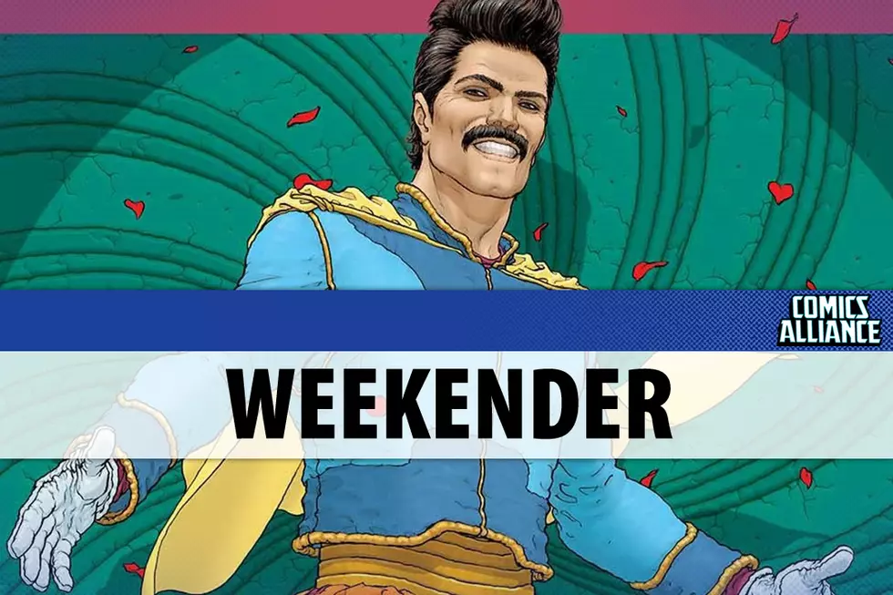
![Frank Quitely & Mark Millar’s ‘Jupiter’s Legacy’ Examined From Top To Bottom [Review]](http://townsquare.media/site/622/files/2013/04/jup1-cov-a-quitely-top.jpg?w=980&q=75)
Frank Quitely & Mark Millar’s ‘Jupiter’s Legacy’ Examined From Top To Bottom [Review]

I have a love/hate relationship with Mark Millar's work. When I was getting back into comics as an adult, his work with Frank Quitely and Bryan Hitch on The Authority and The Ultimates were fairly instrumental in keeping me reading. As time went on, though, and his books descended deeper into pandering to the lowest common denominator, I began losing interest. But he keeps working with artists I dig, so I'm routinely tempted to at least flip through. Jupiter's Legacy is out this week, and it's his first book with Frank Quitely since The Authority ended and the first long form work Quitely has done without Grant Morrison in forever. I like Quitely's art work a lot, and Peter Doherty's colors are generally a treat.
So I sat down with Jupiter's Legacy and tried to figure out what works, what doesn't, and how I feel about that. This is a thorough autopsy, so grab your comic and read along.When I first read them, I thought that the first five and a half pages of Jupiter's Legacy were the best pages Mark Millar's written in ages. It's a familiar scene -- one person convincing another person to let him borrow a boat for a dumb idea -- but well-told. Millar does a good job of setting the stage, and the fact that it was set in 1932 made it even more interesting to me, though I can't quite put my finger on why. I think it's because 1932 forces Millar out of his usual setting, and seeing him stretch new muscles would be very interesting.

The dialogue on these pages feels honest and pulpy in a way that fits Quitely's art well. The pages are lacking in Millar's greatest asset and biggest weakness: his fondness for sensationalism and spectacle. These pages feel desperate and handcuffed in comparison, like someone pushing against his prison walls and finding no give. Jupiter's Legacy opens with desperation and mysticism, the last hope of a once-great man, and then, halfway through page six, it turns into Lost, with a magical island and a mystery for mystery's sake. The island gave people powers, but how?
On the one hand, I get it. The idea that people went to an island, got powers, and then came back and never talked about it suggests that their powers have a dark source. It's effective foreshadowing, but like the rest of the scene, it's pretty cliché. Instead of being "Whoa, a mystery?" I'm feeling more like "Oh. A mystery." There's no excitement there, even though I can tell there's supposed to be.
Luckily page seven comes and we're back to Millar-as-usual! Jupiter's Legacy is another variation on Millar's "What if superheroes were in the real world?" trope, like Ultimates, Nemesis, Wanted, The Authority, Kick-Ass, Supercrooks, and War Heroes. It's worked extremely well in the past, but this go-round just feels tired. This time the focus is on the spoiled children of the original superheroes, and the way their generation has utterly forsaken their heritage. Which, again, is familiar, but okay.
Page eight is where Millar gets really Millar-y. There is no one on this page that isn't a dick, from the weird superheroes groupie to Jupiter's Legacy's main character Brandon Sampson. The dialogue here is excruciating, because it isn't dialogue so much as people talking past one another. It's Brandon Sampson telling us all we need to know about another character, Chloe, who is another superhero and his sister. Meanwhile, a super-groupie tries to fawn her way into his presence, and he rejects her in the most cold-hearted manner ever.
I should explain what I mean by "Millar-y." I've used it as shorthand for ages, and some people instantly know what I mean, but I don't think I've ever defined it properly. Here's a stab:
Mark Millar has a few very remarkable tics in his writing, and they're so noticeable that you can generally spot a Millar comic without looking at the credits by the time you finish the first three pages. There's a certain specificity to the dialogue he puts in his character's mouths that doesn't feel like real life at all and a sneer in his characters.
He deploys diminutives like little missiles of condescension. "Darling," "sweetheart," "little lady," "bud," and "honey" have all been weaponized. Characters are also very specific about numbers, which is strange and even more subjective. You know the end of Watchmen, right? "I did it thirty-five minutes ago?" Millar creates sentences like that often enough for it to be a distraction when reading his work. It's not just the fact that he uses numbers in his dialogue, so much as how they are used and how often, that makes me think it's a tic. It never feels natural.
The secret to recognizing a Millar book is to look for the scum. It'll be somewhere in there, whether it's Kick-Ass jerking off to his crush texting him pictures of her going down on her black boyfriend (a marriage of miscegenation, cuckolding fears/fetish, and basic racism, any way you slice it), Captain America lecturing people in Ultimates, or the incest-related antics in Nemesis. It's that point where a Millar-written comic goes from action/adventure tale to something grosser. It's that feel-bad moment that makes you either pump your fist or cross your arms and shake your head. You can find it on page nine, panel five, when the nameless barely-clothed black chick returns to tell Brandon Sampson that her white friend is in the bathroom and she's DTF, just like he said she would be. The black chick, and her white friend by proxy, is deferent and humble in the face of insulting behavior.

There's the scum.
Pages ten through twelve are the first real action scene, and it works as a Frank Quitely and Pete Doherty showcase. One thing I dig about Quitely's work is that he tends to do a really interesting job when it comes to depicting architecture and rubble. He has a way of depicting wilderness, wasteland, stone, and rubble that's very appealing. The panels on pages ten and eleven are on the same side of a single hill, and that hill slopes downward from left to right in each panel. Quitely maintains that point-of-view for the duration of the scene, though he zooms in and out over the course of the fight. Though the backgrounds are fairly light, there's still a sense of place. Everyone's playing in the same field. It's small, but it counts.
Page twelve has what I've seen described as the killer panel for the comic, when Walter, a psychic hero and brother to the Utopian (our Superman-alike), takes psychic control of Blackstar, the villain of the issue. This psychic control manifests itself as Walter yanking Blackstar into a "psychic painting," essentially a memory that has been turned into a mental "place." Quitely and Doherty's way of visualizing this is to show the blueline art and pencils and such beneath the finished and colored art. It is a cool visual effect, sure, but it's not necessarily new or groundbreaking. It's a variation on a technique that's shown up in Looney Tunes and even in Animal Man.

No, what's really killer about this panel to me is more subtle. Part of the reason why I think Quitely is such a good artist is that he draws everything, and the small touches are sometimes more amazing than the more sensational touches. The incline of the hill that all the heroes are fighting on in the real world is reflected here in this psychic painting. The memory that these two men are walking around in maintains visual continuity from the fight beforehand. There's something fascinating about that to me. I'm no Frank Santoro, so I couldn't tell you what it means exactly. If I had to push, I would say that it has something to do with establishing place and realism for a world, and that maintaining those rules when you change locations keeps the reader believing in this world you've created. That incline is a small thing, but it's more visually interesting than people fighting in a city or on a plateau. It adds just a little more flavor than normal to the fight scene, and that carries through to the psychic painting as a kind of transition from the real world to the mental one.
These pages are also a great way to see what exactly Doherty's bringing to the book. There's a nice symmetry in there between art and plot that I like a lot. Millar's world is our world, but it's treated in the text as a fallen, cynical reality. When a character creates a psychic painting of a beach holiday he took as a kid, it shows up as a bright and happier location. Doherty renders the mountains and sky of Vermont as dark and gloomy, with bluish greys and flat greens. When the scene flips to the psychic painting, he uses brighter versions of the same colors. The green is verdant, instead of muted. The blues are the same shade of blue you'd use as a child when asked to color the sky. They aren't depicting the same place, but there's a visual continuity between the places that I like a whole lot. Quitely excels at establishing a sense of place that feels real, regardless of the action on the page.
In the real world, on page thirteen, the superheroes are fighting dirty. The art doesn't match the text here -- either that or Walter is a sadistic liar, which doesn't seem likely -- but the art is clear enough. The capes are beating the bone marrow out of Blackstar, who they say "killed that entire alien race." He has an anti-matter battery in his chest, but he never gets a chance to use it.
Millar uses the beating to teach us more about the world. Going by the dialogue, the superheroes are supposed to fight in a clean manner as a general rule, but had to break bad this time to get things done. But that's okay, because this guy they just brutalized leveled "half of Missouri" last time he broke out, so they had to ante up. That raises a lot of questions to me. That off-hand mention of massive destruction is frustratingly common as a way to show exactly how bad someone is. Even if "half of Missouri" is an exaggeration, it makes me wonder how their world could possibly be so similar to ours if beings of that power are capable of destroying so much.
Pages fourteen through seventeen are basically an argument between Walter and his brother, Utopian, with occasional input from the rest of the cast. The older capes are disappointed in the younger capes to varying degrees. Utopian's wife Grace -- and Sampson and Chloe's mom -- is grateful her nephew showed up, even if he didn't take part in the fight, and frustrated her children didn't. Utopian is an old fuddy duddy who likes to talk about how "having these powers comes with certain responsibilities." Walter is cool with it, though. Kids will be kids, and they never asked to be born into the family business. He doesn't get along with his brother, and he's chafing under Utopian's influence.

Quitely doesn't have a lot to work with in these pages. The incline is maintained, which is cool, but the fight is over in three panels and three punches. Most of the people on-screen just sorta stand around and watch, and the argument? It's between two bearded white dudes. It's not that visually interesting, honestly, though I do like Walter's jaunty pose on page seventeen, panel five.
One thing that's strange about this scene, and the comic itself, is that everyone looks either terrible or boring. Quitely can be a pretty great costume designer, and an especially great costume redesigner, but I'm not seeing it here. I was particularly struck by his comments in this interview with TJ Dietsch at CBR:
Of course, trends in fashion do tend to be both evolutionary and reactive, so we needed costumes for the younger generation that had grown out of their parents' tradition but also kicked against it. The older generation have a look that grew out of ideas of mythical godliness, monarchy, idealism, authority, altruism, the flag. The younger generation have a look that grew out of consumerism, pedigree, elitism, social status and label-culture.
That sounds like the Quitely I know and love, but Jupiter's Legacy simply doesn't look it. The casual clothes are straight out of today, not tomorrow or a fictional alternate history. Most of the superheroes are wearing the same kind of utilitarian suits that we saw the evil Avengers wear in The Authority. A few characters share an emblem of a hawk with a halo, and a couple oldsters rock capes, but that's as far as the flash goes. The men get boring body suits. The women get boring body suits and an option to reveal their cleavage, belly button, butt, or all three simultaneously.
There's something not working here. A large part of the appeal of superheroes is that they're larger than life. They're vibrant and bright and amazing in a way that normal people are not. Quitely is a great superhero artist because he gets that. He knows that these people, even in street clothes, need to be glorious. His thoughts on design make me think we're going to see something really compelling and forward-thinking and new. But these superheroes aren't new and they aren't glorious.
There's no real spectacle here, outside of the fairly interesting psychic painting idea. There's no cool shot of Utopian using his powers, nothing interesting about the people wearing fancy clothes. We see a dozen or more heroes, and the most any of them do is... punch a dude. There's not even any cool time dilation work like you've seen in Quitely's more recent projects like Batman & Robin or All-Star Superman. The work is just... standard. Quitely is still very good, and his small touches are as great as ever, but this isn't the leap forward I've grown to expect from the guy. It's still good, obviously, but not as good as you'd hope.

Pages eighteen through twenty feature the daughter of Grace and the Utopian, who we previously saw at a charity shindig with her brother. She's doing space-coke with two people who look like they should be speedsters and flamethrowers but are actually probably just really good at punching people. The most interesting thing on these pages are the images that flash across the TV while these characters talk. It's more "world in decline" stuff, and it isn't actually that interesting.
Killing Them Softly, written and directed by Andrew Dominik, had a similarly overbearing gimmick that ended up paying off huge in the end. Here, though? I don't know if I buy it. Millar's done a remarkably poor job of establishing what the world is like. If a hero can drop a one-liner about a guy leveling half of a state, then that makes me wonder what the supervillains are like these days. If the daughter of a hero can snort a bunch of space-coke her friends got from an off-world dealer, I want to know what happened there. How did that influence change the world?
There's a line in the series where the heroes explain that they haven't actually interfered in anything major, like governments and stock markets, and have instead chosen to let humanity chart its own destiny. But if you buy the premise of the series -- "superheroes won us the war, still exist now, and their kids are dicks" -- then that doesn't work to handwave away the question, does it? The world would be different, vastly different, than the world as we know it. Which really screws with the idea of the series, at least for me. The world we've seen thus far is a reasonable facsimile of our world, only more girls wear booty shorts and more dudes are dicks.
Jupiter's Legacy falls short. Millar's characters talk past one another, and Quitely and Doherty don't even really get a time to shine the way I know they can. There are some interesting ideas in here -- I like the island thing, as cliché as it is, Quitely will always be a draw, I'm digging Pete Doherty but wish he had more to work with -- but as a whole? As a book Millar has hyped as the summer event of 2013? It's missing the spectacle that makes Millar's work go, the characterization is tired, and the art's good, but not good enough to overcome the problems with Millar's script. The most interesting parts of the book at this point is the relationship between the old and new generation, and that's relegated to purely expository declarative statements instead of conversation or real conflict. I'm interested in seeing how the division between the generations shakes out, and more of the world's status quo, but I can't say as I was particularly hooked by this issue. I could see them sticking the landing toward the end of the ten-issue bimonthly series, but the first issue isn't a good omen.


More From ComicsAlliance


