![When Everything Is Pink, Nothing Is Pink: Sarah Stern On Color And Creativity [Interview]](http://townsquare.media/site/622/files/2017/03/Cindersong.jpg?w=630&h=882&zc=1&s=0&a=t&q=89&w=980&q=75)
When Everything Is Pink, Nothing Is Pink: Sarah Stern On Color And Creativity [Interview]
Sarah Stern is an up-and-coming talent in the world of comics. She primarily provides color art for comics like Goldie Vance and Brave Chef Brianna, but she's also created storyboards for animation, and recently created a webcomic, Cindersong, which she writes, illustrates, and colors herself.
ComicsAlliance had the chance to talk to Stern at Emerald City Comicon, where we nerded out about how the heck colorists create magic on the page, and talked about fantasy worldbuilding and making friends in the comics world.
ComicsAlliance: You’ve done awesome color work for a number of comics --- Goldie Vance, Mighty Morphin Power Rangers: Pink, Star Trek: Waypoint. How do you go about choosing a color palette for each comic?
Sarah Stern: It’s dependent on the comic. A lot of them have pre-existing color palettes. For something like Star Trek, the walls are going to be white and the uniforms are very nicely color-coded… [laughs] With Goldie Vance, I came in and there were materials from the pitch already, so the character palettes were very set. But you have a lot of freedom in the environments, especially if they’re new to that issue, and you can sometimes tweak existing palettes to make everything more consistent.
Brittney Williams did all the pitch materials for Goldie, and she’s an excellent colorist, but her natural palette tends to go a lot cooler than mine. So I adjusted things just a little bit; if I had left everything in her very nice colors, I would have been fighting uphill to match that every issue.
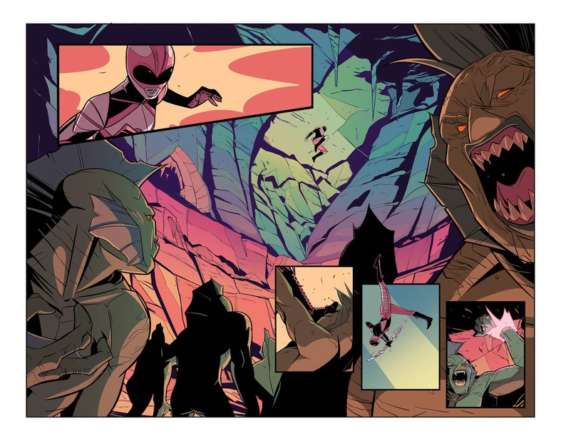
And with Pink, because it was Kim in a new environment on a new adventure --- finding herself and having a great time, beating up naked fish men --- there was a lot of freedom with that too. Because no-one had ever been to that fictional picturesque European seaside town, I could do what I wanted with it.
CA: For something like Pink, there's a color right there in the title, so obviously there's going to be a lot of pink. Are there ways to incorporate that pink, that one color, without making it boring?
SS: Yeah! I really like pink just as a color, and just because I think it’s great --- it’s a very malleable color that works with a lot of palettes, and it improves everything that it’s in. With the Pink Ranger comic, I actually wanted to make sure that I limited the amount of pink that I used, because when everything is pink, nothing is pink.
Kim obviously always has a lot of pink on her, and there’s some pink worked into the environment even subtly in overlays, but I wanted to make sure there was enough variety [in the colors] that pink was still a featurable thing. You don’t want to go pink-blind! [laughs]
CA: How much of the color is influenced by the line work? Do you find that when you’re working with different artists, you approach it a different way?
SS: Definitely. It comes down to a couple different things. There’s the level of detail that the artist or inker puts into the final line art, that will affect how much shading you need to use. And things like the lighting --- if they very clearly define the lighting themselves, you can kind of just follow along. Not that it’s lazier [laughs], but it’s easier. The more work that’s done at an earlier stage, the easier the rest of the process is, just by nature.
With things like shading and lighting, when you’re defining shapes in lighting, you want to echo the shape language that the artist uses. So for Brittney in those first eight issues of Goldie --- I love Brittney’s art. She has this really nice compact, cartoony, scrappy kind of retro look, so you just echo her sharp curves.
For someone like Noah Hayes, who’s the new artist on Goldie, and Daniele [Di Nicuolo] who does Pink… Noah’s very animation inspired, and Daniele has a really sleek Euro-manga sort of style. It’s hard to pin Daniele down with words, he’s just magic. Their shape language is longer and smoother. You want to do your best to back the artist up, basically, and to try to make the final colors look natural with their lines.
If you color for every artist in the exact same way… you couldn't just use a totally universal rendering style if you tried, in my opinion. And you pick palettes by the individual story.
CA: Do you still feel like you have your own distinct style when you’re coloring?
SS: I think so! One of my most recent proudest moments was when Sarah Gaydos brought me on to do some Star Trek stuff and said, “Just to warn you, the licensor doesn’t like pink that much.” This was early in our relationship, she didn’t know me that well yet, but she was like, “I know what this girl is up to.” [laughs] I’m still pretty early on [in my career], but there are some distinctive traits some colorists have. If you’ve read enough of their work, you can pick it out. You know a Jordie Bellaire when you see it, you know a Tamra [Bonvillain] when you see it.
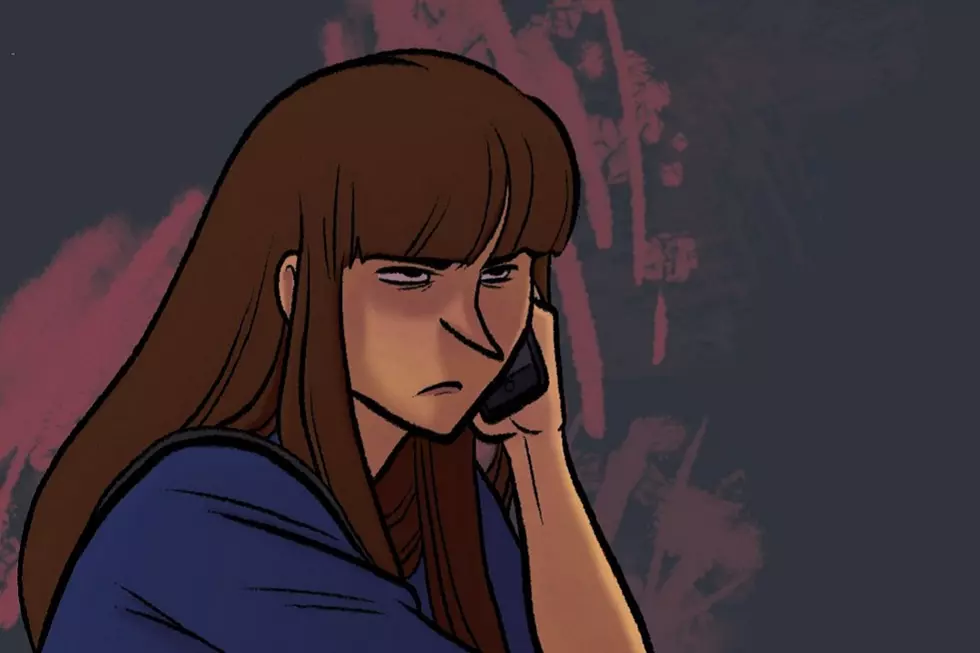
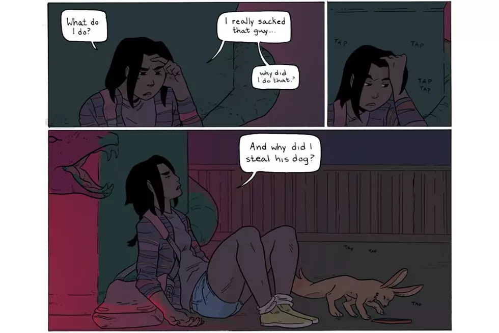
CA: I know you have a new webcomic just starting, called Cindersong. Can you tell us a bit about it?
SS: It’s very new! I worked on it for my thesis, it was a worldbuilding thesis about implementing effective magic systems, specifically for comics. I referenced a lot of fantasy literature studies and tried to adapt that to comics. It’s what everyone wants to see: it’s a long winded fantasy story! [laughs] It’s still really new, I don’t have that two-sentence pitch yet. It’s a fantasy friendship comic---
[At this point a dancing robot cosplayer walks by blasting the theme from Ghostbusters, so we pause for a minute to watch.]
SS: What are you? He’s like a bear slurpy cup! What happened?
CA: I got nothing.
SS: [laughs] Anyway, it’s a fantasy friendship comic, with a moderate amount of cooking and romance.
CA: Cooking? Okay, I’m looking forward to this.
SS: Cooking, yeah! I’m trying to establish a more grimdark setting and then subvert that a little bit. I love Game of Thrones as much as the next fantasy buff, but I’m tired of watching people die and suffer just for the thrill of it.
CA: With Cindersong, you’re writing and drawing and doing all the color work yourself. Do you find your approach to color is different when it’s your own art?
SS: Yeah definitely, because I can plan ahead while I'm drawing. I can do things like render the environments with flat colors that’ll be simpler than drawing everything out. There's also less guesswork with color choices because I usually know what I want while I'm drawing it, and I would already have all that reference on hand too!
You get really good results when there’s some streamlining between the drawing and color --- I mean, that should be obvious. For example, Daniele is one of my favorite collaborators right now. For one, he’s a sweet boy. He is a good, good drawing boy. Also one of the first things he did was introduce himself and ask, “How do you do pages? Because I’ll lay my stuff out to help you!”
He’ll do things like… I pointed this out to the editors as we were wrapping up because I wasn’t sure if they noticed or not, but he’ll put diagrams in the pages. Like, if they have a new costume, because he designed all the Power Rangers costumes in Pink, and I think they’re wonderful, he’ll put placeholders in for where the colors will be, because otherwise it’s a mess of stripes. If there’s a far shot with like ten Power Rangers in it, he’ll put down “Blue. Green. Yellow,” so that I know which is which right away.
And he’ll separate out layers so I can just do color holds in the backgrounds in a single click. He’s great. And if I have questions, I know I can just message him. Not that anyone is less of a great artist if they’re not an active communicator, it’s just nice to have someone who says, “Hey! How can I help? Let’s be pals and also make a great great comic."
It’s also nice to get to know the people you’re working with outside of conventions, because you usually don’t have a ton of time to talk. It’s always nice to have friends, you know? You rarely regret just making a pal in the same industry.
CA: You mentioned Cindersong came out of your thesis. What did you study?
SS: I did my MFA in sequential art at SCAD, and that thesis is a written component with comic pages that support it. I think I did 25 pages of the comic and probably 40 pages of the actual paper. It was really long! It was about effective magic systems, and I based a lot of it around Sanderson’s Laws of Magic and Farah Mendelsohn’s taxonomy of worlds.
Once you delve into it --- the study of fantasy as literature is kind of new! Like people agreed that fantasy was a genre term in the '70s. Very recently! With your thesis you’re encouraged to fill out an area of comics academia that’s not been explored.
I was interested in representation and color theory, but I wanted to discuss something that was closer to my own experiences at the time. I’m a big reader, so I was like, “Why don’t I use this as an excuse to talk about Brandon Sanderson for 20 pages?” [laughs] It ended up being a really fun thesis, and apparently it wasn’t super boring to read. I was thinking of making it into a big infographic. When I have too much time on my hands, I’ll do that. [laughs]
More From ComicsAlliance